Forms need to be populated with controls and menus in order to be useful. Controls are the interface elements through which the end user makes choices or obtains information. Buttons, text boxes, checkboxes, list boxes, and charts are all examples of controls supplied with ATEasy. Controls have their own properties, methods and events to make them suitable for particular purposes; for example, displaying text, or allowing the user to scale a value.
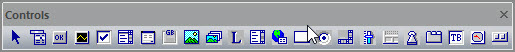
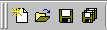
Controls and menus are added from the Controls toolbar. The Controls toolbar appears on the screen whenever the form view is active. It contains all the available controls that can be placed on a form as shown here:
The first button in the toolbar (appears on the left side) is the selection tool. The second button (showing a menu) is used to add a menu to the form. The rest of the buttons are controls. To add any one of these controls, click on it, then click in the form client area, and drag the control to the appropriate size.
ATEasy provides the following controls:
Type |
Description |
Appearance |
Tool |
AButton |
Typical Windows button with some added features. Used for confirmation (OK, Cancel, etc.) |
|
|
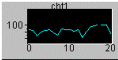
AChart |
Displays a set of Y-data versus a set of X-data using one of several predefined plot templates. |
|
|
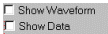
ACheckBox |
A check box indicates whether a particular condition is on or off. Use check boxes in an application to give users true/false or yes/no options. |
|
|
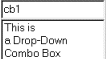
AComboBox |
Combines the features of a Text Box and a List Box. Allows the user to select either by typing text into the Combo Box or by selecting an item from its list. |
|
|
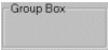
AGroupBox |
Used as a frame to group several controls together. |
|
|
AImage |
Displays a graphic image. |
|
|
AImageList |
Does not have any user interface. Stores a list of images to be used by the AToolBar control. |
N/A |
|
ALabel |
Displays text. Also, used to label controls such as AListbox to describe their content. |
|
|
AListBox |
Allows the user to select an item from a given list. |
|
|
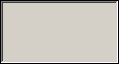
APanel |
Container control. Used to group several controls under same container. Hiding this control will hide all its controls. |
|
|
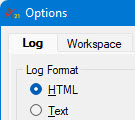
ALog |
Based on Internet Explorer. Provides a versatile way to record test results. Test data can be routed to the Log Control (instead of the ATEasy standard Log) in plain Text or HTML formats. |
|
|
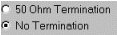
ARadioButton |
Presents a set of two or more choices to the user. Unlike check boxes, radio buttons work as part of a group; selecting one radio button immediately clears all the other buttons in the group. |
|
|
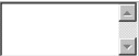
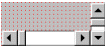
AScrollBar |
Horizontal and vertical scroll bars allow you to select a value by moving the scrollbar thumb. |
|
|
ASlider |
A control containing a thumb, numerical, and text labels. Supports a variety of styles from three main groups: slider, knob, and meter (shown). |
|
|
AStatusBar |
Used for displaying a status bar on a form. The status bar contains panes that can display text, images, keyboard state and more. |
|
|
ASwitch |
Represents a switch with enhanced style and mode features. The style can be as a toggle (shown), a slide, LED, push button, and more. |
|
|
ATab |
Allows definition of multiple pages for the same area of a form. Each page consists of a certain type of information or a group of controls that the application displays when the user selects the corresponding tab. |
|
|
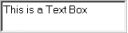
ATextBox |
Can be used to get text input from the user or to display text. |
|
|
ATimer |
Does not have any user interface. Used for generating events periodically. Can be used to refresh the controls on a form periodically. |
N/A |
|
AToolBar |
Used for displaying a toolbar on a form. The toolbar can contain buttons, check button, group buttons and menus. |
|
|


