Theme Property (AForm) |
Version 14/2026 |
Returns or sets the theme style of the form buttons that their Theme property is set to aDrawingThemeDefault (0).
Object.Theme [ =enTheme ]
The Theme property syntax has the following parts:
Name |
Type |
Description |
Object |
AForm |
AForm object |
enTheme |
enumAFormDrawTheme |
drawing theme |
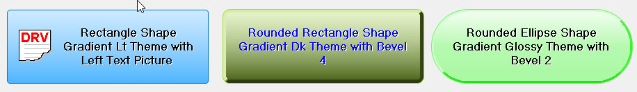
enumAFormDrawTheme can be one of the following:
Name |
Value |
Description |
aFormDrawThemeClassic |
0 |
For backward compatibility. Similar to setting the XPStyle property to False. The buttons in the form appears similar to older Windows if their Theme property is set to Default (0). |
aFormDrawThemeWindows |
1 |
Windows default theme |
aFormDrawThemeGradientLight |
2 |
Light gradient theme |
aFormDrawThemeGradientDark |
3 |
Dark gradient theme |
aFormDrawThemeGradientGlossy |
4 |
Glossy gradient theme |
The Theme property changes the way the buttons (AButton controls) and other controls on the form are drawn.
In aFormDrawThemeClassic mode is set than all the forms controls drawn with older Windows style (3D style) while the other themes (1-4) are drawn using Windows theme and appear flatter. Buttons (AButton controls) that their Theme property is set to aDrawingThemeDefault (0) will be redrawn and use the form Theme property value. If the form Theme is set to aFormDrawThemeClassic then the AButton will be drawn as classic theme.
Here are some example showing the button using various settings:
The following statement changes the AForm AButton with default theme to light gradient while the OK button is set to dark gradient:
frm.Theme=aFormDrawThemeGradientLight
btnOK.Theme=aDrawThemeGradientDark