Control
Example
Description
Push button, bitmap button, bitmap and text button. The button can have different shapes.
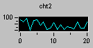
A convenient way to graphically display dynamic information, such as a wave function output.
Similar to the ActiveX checkbox control.

In three styles: DropDown, DropDownList, and Simple.
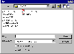
Consists of a standard set of dialog boxes for operations such as opening and saving files, setting print options, and selecting colors and fonts. The control also has the ability to display help by running the Windows Help engine.
Can contain other controls. If it contains more than one ARadioButton, only one button may be selected at one time.
Not applicable
A graphical representation of a control in its current state, useful for insertion into log reports.
Not applicable
The AImageList object defines a list of images, used for example, on an AToolBar.
Similar to the ActiveX label control.
Similar to the ActiveX listbox control.
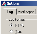
Displays the ATEasy log in either text or HTML format.
Container control. Used to group several controls under same container. Hiding this control will hide all its controls.
Similar to the ActiveX radiobutton control.
Similar to the ActiveX scrollbar control. With horizontal and vertical scroll bars.

A variable value control, allowing such features as a gas gauge.
A window, usually at the bottom of a parent form, through which an application can display various kinds of status data.

A switch with states like on/off or 100/200/300 etc.
Allows definition of multiple pages for the same area of a form. Each page consists of a certain type of information or a group of controls that the application displays when the user selects the corresponding tab.
Similar to the ActiveX textbox control.
Not applicable
Sends out an event notification at discrete intervals of time. The control is useful for background processing and is invisible to the user at run time.
The AToolBar control contains a collection of Button objects used to create a toolbar that is associated with an application.