The ASlider control is a window containing a thumb, numerical and text labels, and optional tick marks. When the user moves the thumb, using either the mouse or the direction keys, the control fires notification events to indicate the change.
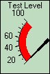
The ASlider control supports a variety of styles from three main groups: slider, knob, and meter. Below is an example of a slider control with the meter style:
The following table lists some of the property settings used for the above example.
|
Object |
Tab |
Property |
Setting |
|
Slider |
General |
Name |
ASlider1 |
|
|
|
Position |
X=109,Y=26,W=71,H=105 |
|
|
Control |
Caption |
Test Level |
|
|
|
Style |
7 - Left Meter |
|
|
Axis |
Min |
0 |
|
|
|
Max |
100 |
|
|
|
ReverseOrder |
(selected) |
|
|
|
ArcAngleStart |
315 |
|
|
|
ArcAngleEnd |
225 |
|
|
Thumb |
Style |
1 - 3D |
|
|
|
FillStyle |
1 - Fill To Max |
|
|
Value |
Value |
0 |
The Slider control can be used as both an input device and an output device.
When used for input, the user can drag the thumb, shown here as a black point line directed at the zero value, to change the value of a variable.
When used for output, the thumb can show the real-time value of a variable.
For more information on the Slider control, see ASlider in the Programming Reference.