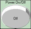
The ASwitch control is a push button with enhanced style and mode features. The button can be pressed to send an "on" or "off" message to another control, and changes visibly to indicate to the user which state the button has entered. The possible styles for the ASwitch control include a toggle, a slide, an LED (light emitting diode appearance), push button, custom bitmap button, etc. The control can change its behavior: it can serve as an indicator, 'switch when pressed', or 'switch when released'. Below is an example of an ASwitch control:
The following table lists some of the property settings used for the above example.
|
Object |
Tab |
Property |
Setting |
|
Switch |
General |
Name |
ASwitch1 |
|
|
|
Position |
X=126,Y=32,W=99,H=94 |
|
|
Control |
Caption |
Power On/Off |
|
|
|
Style |
6 - Round Push Button |
|
|
|
Mode |
1 - Switch when pressed |
|
|
|
OffText |
Off |
|
|
|
OnText |
On |
In the above example, when the user clicks the mouse over the button, the button's appearance changes to show the button 'pushed in' and the text on the button changes to 'On'.
|
|
|
|
|
|
For more information on the Switch control, see ASwitch in the Programming Reference.


