 on the Control Toolbar, followed by dragging within the form's client
area will create an ATextBox control,
as shown below.
on the Control Toolbar, followed by dragging within the form's client
area will create an ATextBox control,
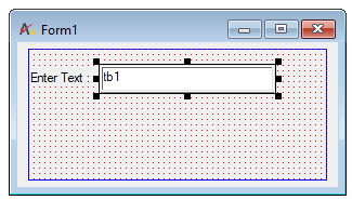
as shown below.Clicking on the ATextBox icon
on the Control Toolbar, followed by dragging within the form's client
area will create an ATextBox control,
as shown below.
The ATextBox control is a versatile control that can be used to get input from the user or to display text. The ATextBox control should not be used to display text that you do not want the user to change, unless you have set the Locked property to True.
The actual text displayed in a text box is controlled by the Text property. It can be set in three different ways: at design time in the Properties window, at run time, by setting it in code, or by input from the user at run time. The current contents of a text box can be retrieved at run time by reading the Text property.
By default, a text box displays only a single line of text and does not display scroll bars. If the text is longer than the available space, only part of the text will be visible. The look and behavior of a text box can be changed by setting two properties, MultiLine and ScrollBars, which are available only at design time.
Note: The ScrollBars property should not be confused with the AScrollBar control, which is not attached to text boxes and has its own set of properties.
Setting MultiLine to True (its default is False) enables a text box to accept or display multiple lines of text at run time. A multiple-line text box automatically manages word wrap as long as there is no horizontal scroll bar. The ScrollBars property is set to 0-None by default. Automatic word wrap saves the user the trouble of inserting line breaks at the end of lines. When a line of text is longer than what can be displayed on a line, the text box wraps the text to the next line.
Line breaks can be entered in the Properties window at design time using the string escape sequence conventions. For example entering "First line\r\nSecond line" in the Text textbox of the control property page will show two lines in the text box . Within a procedure, you create a line break by inserting a carriage return followed by a linefeed (ANSI characters 13 and 10). For example, the following event procedure puts two lines of text into a multiple-line text box (Text1) when the form is loaded:
tb.Text="First Line\r\nSecondLine"
You can control the insertion point and selection behavior in a text box with the SelStart, SelLength and SelText properties. These properties are only available at run time.
When an ATextBox control first receives the focus, the default insertion point or cursor position within the text box is to the left of any existing text. It can be moved by the user from the keyboard or with the mouse. If the text box loses and then regains the focus, the insertion point will be wherever the user last placed it. To regain control over where text is inserted, you can use the SelStart and SelLength properties.
The SelStart property is a number that indicates the insertion point within the string of text, with 0 being the left-most position. If the SelStart property is set to a value equal to or greater than the number of characters in the text box, the insertion point will be placed after the last character
The SelLength property is a numeric value that sets the width of the insertion point. Setting the SelLength to a number greater than 0 causes that number of characters to be selected and highlighted, starting from the current insertion point. If the user starts typing while a block of text is selected, the selected text will be replaced. In some cases, you might want to replace a text selection with new text by using a paste command. The SelText property is a string of text that you can assign at run time to replace the current selection. If no text is selected, SelText will insert its text at the current insertion point.