 control
in the Controls toolbar, and then drag on the form background to the size
desired.
control
in the Controls toolbar, and then drag on the form background to the size
desired.Using the APanel Control |
Version 5 |
APanel controls are used to group other controls and thus they are containers. There are several reasons for grouping controls. One is visual grouping. Grouping of related form elements gives a clear user interface similar to the group box control. The panel further supports scrolling of controls using a scroll bar. Another is programmatic grouping - radio buttons for example. The last is for moving, showing/hiding or enabling the controls as a unit at design time. When you make a panel control invisible, all its controls are invisible.
The Panel control is similar to the GroupBox control; however, only the Panel control can have scroll bars, and only the GroupBox control displays a caption. As with the GroupBox control, if the Panel control's Enabled property is set to false, the controls contained within the Panel will also be disabled.
The Panel control is displayed by default with the border style Inset. You can set to different border styles - standard or three-dimensional border using the BorderStyle property - there are three choices: Single, Inset, Raised, and None - enumAPanelBorderStyle. This will distinguish the area of the panel from other areas on the form.
You can use the AutoScroll property to enable scroll bars in the Panel control. When the AutoScroll property is set to true, any controls located within the Panel (but outside of its visible region), can be scrolled to with the scroll bars provided.
To create a panel, click on the APanel
control
in the Controls toolbar, and then drag on the form background to the size
desired.
Add other controls to the panel, drawing each inside the panel. If you have existing controls that you want to enclose in a panel, you can select all the controls, cut them to the Clipboard, select the Panel control, and then paste them into the panel. You can also drag them into the panel.
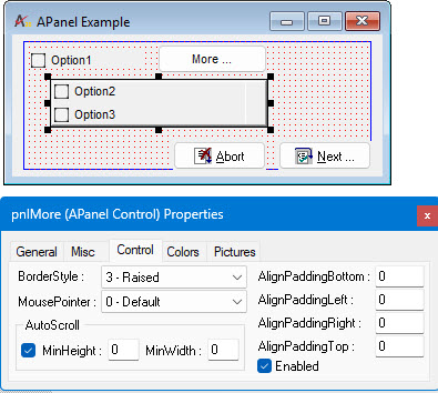
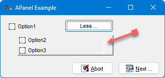
In this example the APanel control contains two check boxes Option1
and Option2, this allows the program to hide or show both controls when
the user press the Less button by hiding the panel control using its Visible
property:
The following image shows the form is design and the panel control properties: