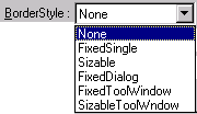
The border style affects the form window characteristics, as shown in the table below. The default border style in ATEasy is "Sizable."
|
The border style affects the form window characteristics, as shown in the table below. The default border style in ATEasy is "Sizable."
|
|
The complete set of form window characteristics includes:
Visible, Moveable, MinButton, ControlBox, RightToLeft, Enabled, ClipControls, MaxButton, WhatsThisButton, KeyPreview.
Some form window characteristics are disabled by the border style; the disabled characteristics are shown in the chart below:
|
BorderStyle |
Comments |
Properties Not Used |
|
None |
No border or border-related elements. Title bar shown. |
MinButton, ControlBox, MaxButton, WhatsThisButton |
|
FixedSingle |
Can include Control-menu box, title bar, Maximize button, and Minimize button. Resizable only using Maximize and Minimize buttons. |
|
|
Sizable (Default) |
Resizable using any of the optional border elements listed for FixedSingle.
|
|
|
FixedDialog |
Not resizable. Useful for standard dialog boxes. |
MinButton, MaxButton |
|
FixedToolWindow |
Displays a non-sizable window with a Close button and title bar text in a reduced font size. The form does not appear in the Windows taskbar. Useful for creating toolbox-style windows. |
MinButton, MaxButton, WhatsThisButton |
|
SizableToolWindow |
Displays a sizable window with a Close button and title bar text in a reduced font size. The form does not appear in the Windows taskbar. Useful for creating toolbox-style windows. |
MinButton, MaxButton, WhatsThisButton, |
StartUpPosition is a combo box specifying the position of the form when it first appears. Possible values are:
Manual - No initial setting specified.
Owner - Center on the owner window to which the form belongs. The load statement determines the owner window.
Screen - Center on the whole screen. (Default)
Default - Position in upper-left corner of screen.
These positions are affected by the Top and Left properties, which are found under the Scale property tab. The Top and Left properties specify the form's distance in units (the default unit is the pixel) from the topmost and leftmost point of the screen. In particular, the initial screen position for the Manual and Default settings will be offset by the values for Top and Left. The Height and Width of the form, as specified under the Scale tab, will have no bearing on StartUpPosition.
A pull-down menu specifying the initial visual state of the form at run time. Possible values are:
Normal - at actual size.
Minimized - shrunk to an icon.
Maximized - expanded to fill the entire container. In the case of an MDI child form, the container will be the parent MDI form which acts as a frame. In the case of an parent MDI form or a normal form, the form will be expanded to fill the entire desktop window.
Left, Top, Right, Bottom - the size of each border for aligned (docked) controls.
Checkbox indicating whether or not the running form will appear as an entry in the taskbar at the bottom of the screen.
If checked, scroll bars will automatically appear if controls are placed outside of the visible client area.
Min Height - the height of the container client area in auto scroll mode.
Min Width - the width of the container client area in auto scroll mode.
If checked, the form will be auto scaled based on the Font size by adjusting its size and its controls. This property is to support Touch Panel Interface where you want to set form's font size to be for example 16.
Checkbox indicating whether or not the form will be visible at run time. A reason to make a form invisible might be if the user intends to subsequently make the form appear using code in a procedure.
Checkbox indicating whether the user can move the form at run time. Regardless of this box's setting, the form can still be moved programmatically at run time using the Move() function.
Checkbox indicating whether or not the form will have an enabled Minimize  button in the title bar. The Minimize button will reduce the form to a taskbar entry at the bottom of the screen. In the case of MDI child forms, the minimized form's title bar will be located at the bottom of the MDI parent window.
Checkbox indicating whether or not a control-menu box  is displayed on a form at run time. The control-menu box is displayed at the leftmost side of the form's title bar. When you click the control-menu box, a list of options is displayed:

The Move option, when selected, turns the pointer to an arrow-headed cross-hair shape, and allows the user to move the form using the mouse. The Size option, when selected, turns the pointer to an arrow-headed cross-hair shape, and allows the user to alter the size of the form using the mouse. The Minimize option shrinks the form to an icon or taskbar entry, while the Maximize option expands the form to fill the entirety of its container. The Close option shuts down the window. The Next option, which is available only for MDI child forms, shifts focus from the current child form to the next child form, if one exists.
When a window has been reduced to a taskbar entry, a right-click with the mouse on the entry will bring up the control-menu list.
This property accommodates the use of languages such as Hebrew and Arabic, whose scripts run from right to left, instead of left to right as Western scripts do. When the RightToLeft property is checked, caption text reading order is right to left, and the Alignment property is set to Right Justify to right align the caption text.
The Windows system locale should also be set to right to left language such as Hebrew or Arabic, see its further info.
This property enables the form to receive focus. When this property is left unchecked, the form is disabled -- it displays, but it is grayed out, and cannot come to the foreground.
A checkbox property which, when selected, causes the container -- here, the form -- to define a clipping region when painting the container around most controls. The outline used to determine what parts of the form are painted or "clipped" when the form is displayed defines the clipping region for that form.
Checkbox indicating whether or not the form will have an enabled Maximize button  in its titlebar, which will expand a minimized form to its full size, or expand a full-size form to the size of the container window.
Also see MinButton.
Checkbox indicating whether or not the form will contain a What's This button.  When the What's This button is pressed, you will enter into What's This mode. The cursor changes to a question mark.
  When you move the cursor over a form feature, for example, an input field, and click the mouse, What's This Help for that feature will be displayed, assuming that What's This Help has been defined for the form feature in question.
Checkbox indicating whether keyboard events for forms are invoked before keyboard events for controls. If the box is unchecked, which is the default behavior, controls receive keyboard events before the form; if the box is checked, the form receives keyboard events before the controls. KeyPreview is useful when you want to provide a key-handling routine for a form; it makes sense to have the handler at the form level, rather than writing individual handlers for each of the controls.